Checkout Mobile UX Optimazation
UX Adjustments to Drive Mobile Conversion in the E-Commerce Flow
Project Overview
In this project, I was tasked with optimizing the Domain checkout flow for the US market using a mobile-first strategy. While over half of orders were placed on mobile devices, the mobile conversion rate significantly lagged behind that of desktop users — revealing a clear opportunity to improve mobile performance.
Our goal was to increase mobile checkout conversion by 4% and drive a 1.5% lift on desktop, through a series of quick, low-effort UX improvements rather than a full redesign.
Roll: UX Designer
Team Member: Product Owner, Content UX Designer
Company: IONOS SE
PROBLEM FRAMING
Why was mobile underperforming - and where did users drop off?
Despite a growing share of mobile traffic in the US market, our analytics revealed that mobile users were converting significantly less often than desktop users — with a conversion rate gap of approximately 2.8 percentage points.
After reviewing performance metrics and stakeholder input, we identified three key factors contributing to this performance gap:
Language Misalignment
Linguistic expressions do not meet the expectations of American users.
Mobile UI Friction
Interface elements not optimized for mobile.
Market-Specific UX Gaps
Processes not tailored to local user habits.
Design Strategy
Design Principles: Mobile First / Conversion Driven / Less is More.
Desktop follows mobile with minor adjustments
Mobile First
Conversion Drive
Focus on upsell product business and checkout process speed.
Less is More
Attention to detail on minor adjustments.
How might we streamline the mobile checkout experience to increase clarity, reduce drop-offs, and align with US market expectations?
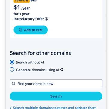
Design Process
We split optimization into two parts: the UX process and UI details (both UI and Copy). There is one content designer and two UX designers in the team. I was responsible for the UX flow and UI details optimization, and at the same time, I discussed with the other two designers about the optimization of the language and copy, and finally reviewed with the Prodcut Owner to provide two to three options for each of the three parts of the optimization for the next step of user testing and discussion.
Current Userflow
Domain check result
Add to cart (upsell 1)
Add extra products
Confirmation
Signup
Confirmation
Payment
1
2
3
4
5
6
7
Problems
Solution
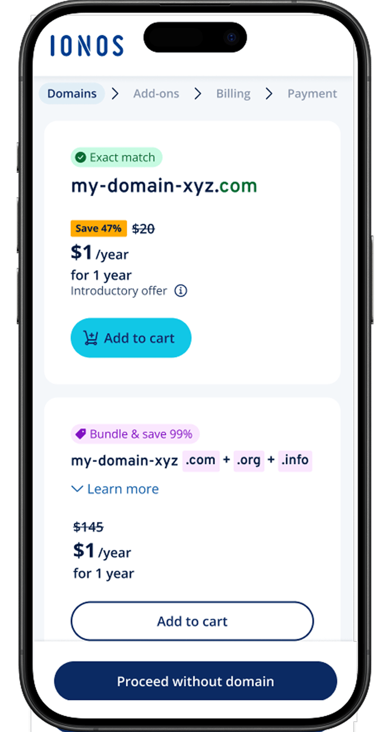
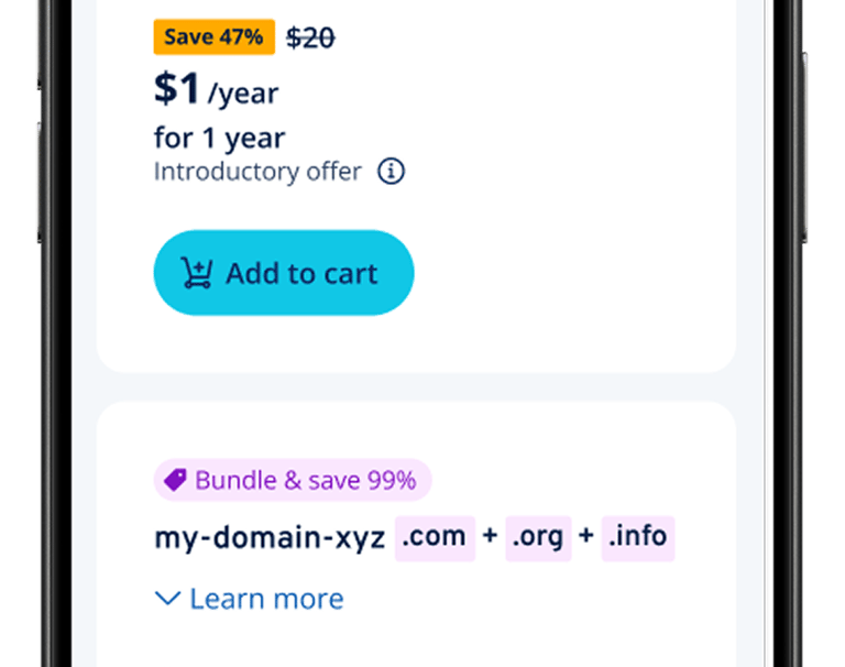
Shorten checkout steps, add breadcrumb
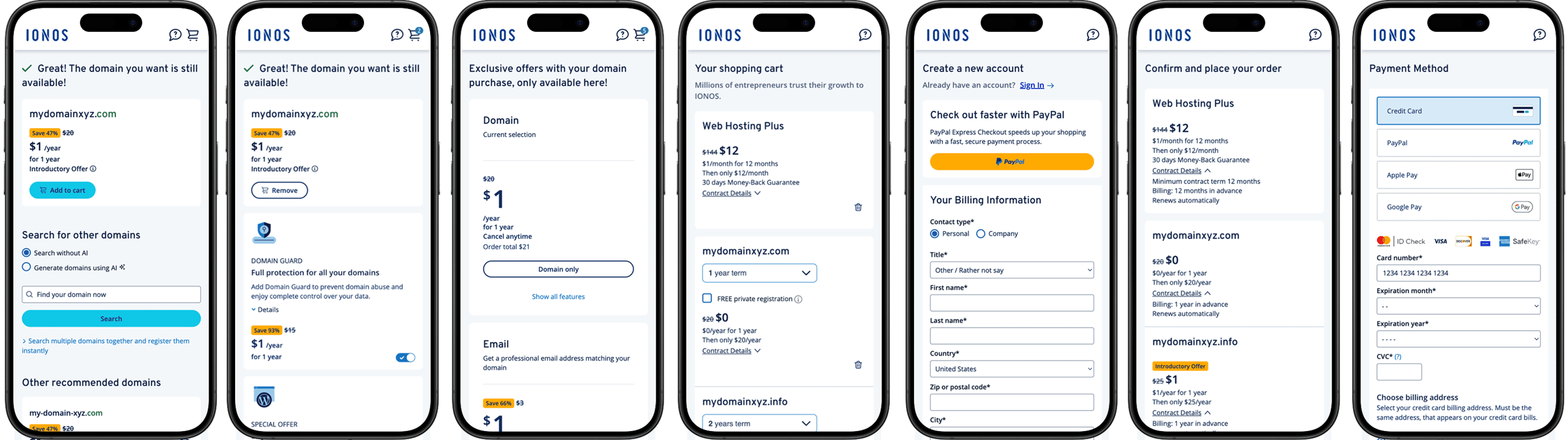
To address the complexity and lack of clarity in the original checkout flow, we streamlined the process by reducing the number of steps from seven to four. Additionally, we introduced a breadcrumb-style progress indicator to clearly show users where they are in the journey. This improvement helped reduce cognitive load and user anxiety, leading to fewer drop-offs during checkout.
Step 1: Domain check result
Step 2: Add-ons
Step 3: Billing
Step 4: Payment
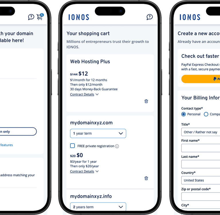
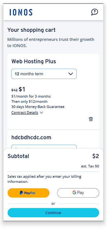
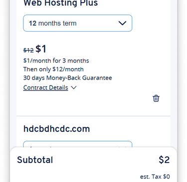
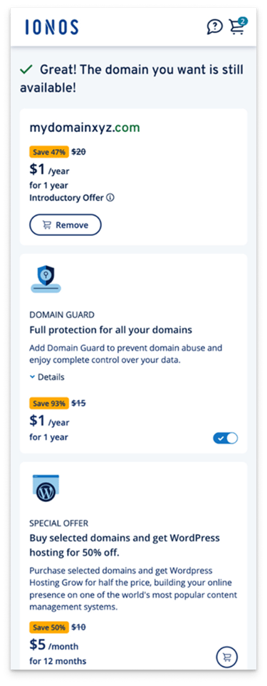
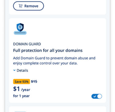
Moving out the repeated cart confirmation during checkout flow, and change cart from full page to a embedded cart summary.
CART
We replaced the full-page cart with an inline embedded view to keep users within the checkout flow. This reduces page transitions, maintains context, and encourages users to proceed smoothly—especially on mobile.
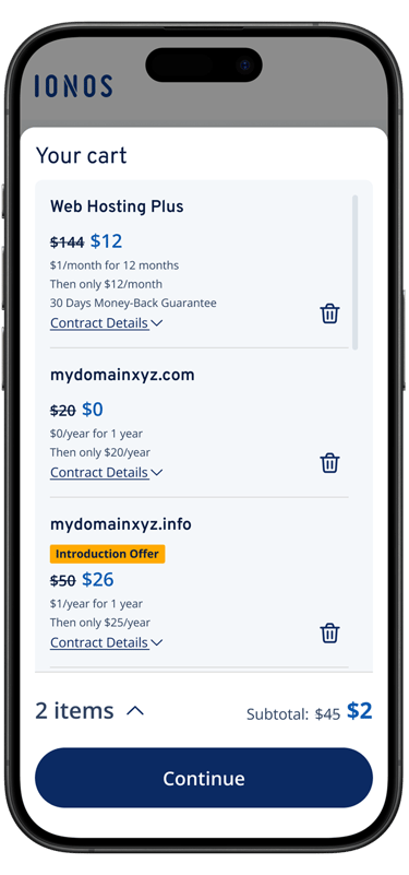
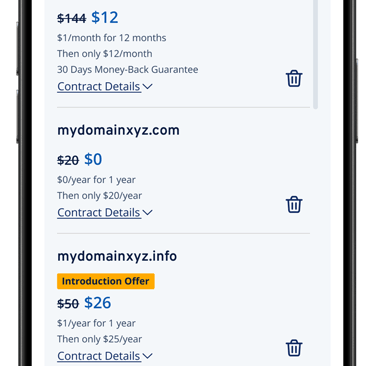
Original
Current embeded cart sammary
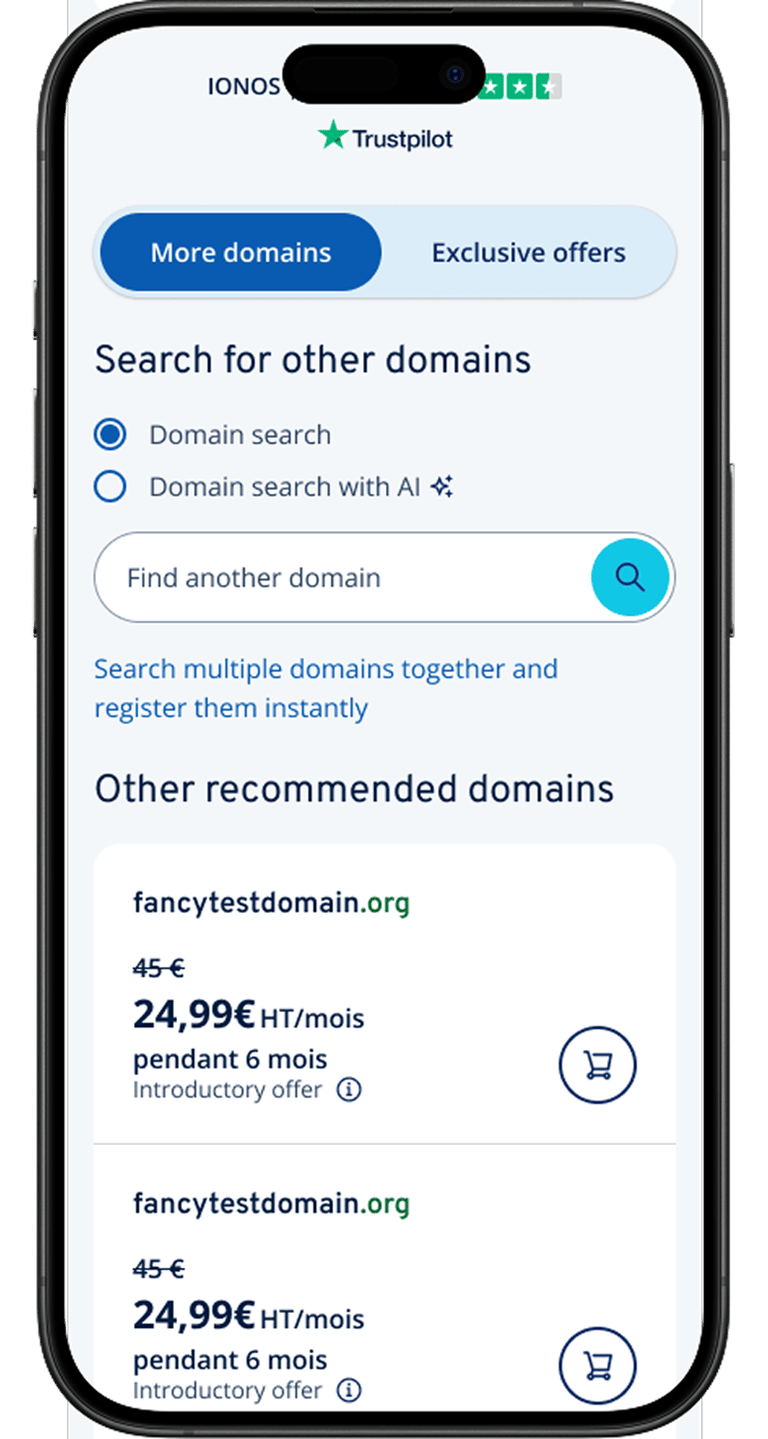
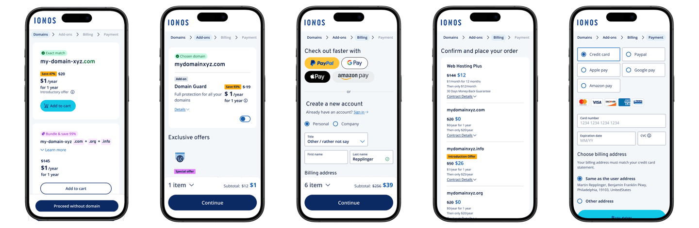
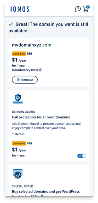
New domain check results card integrated with upsell products.
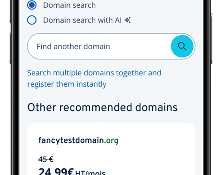
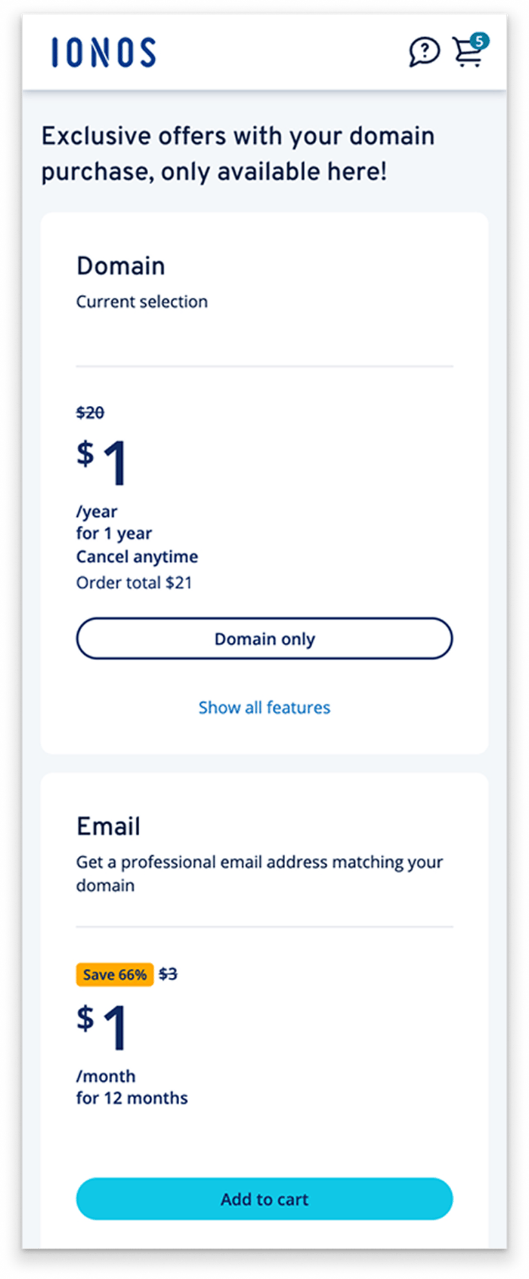
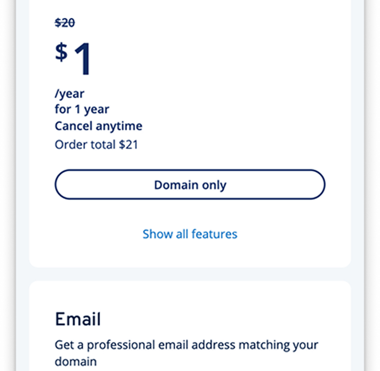
DOMAIN CHECK RESULT PAGE
In order to solve the mobile page space and length, we remove the heading and change it to the form of badge, and integrate the recommended additional products into the domain name query result card to increase the product relevance and thus improve the conversion rate.
Before
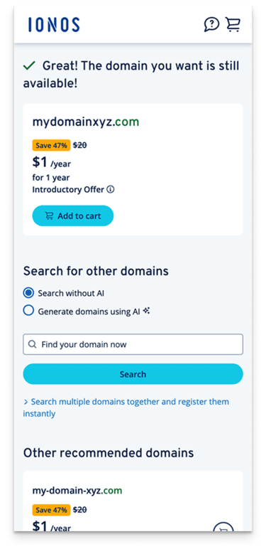
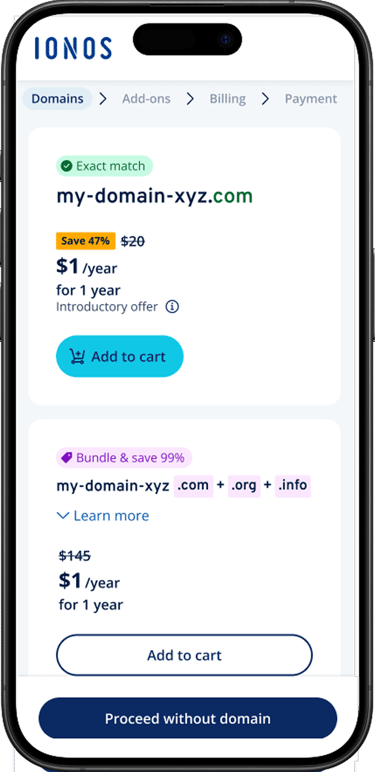
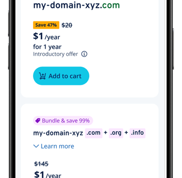
After: Card view with pills
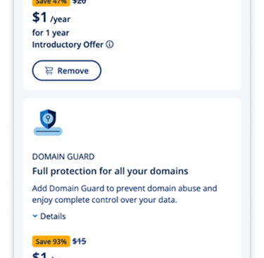
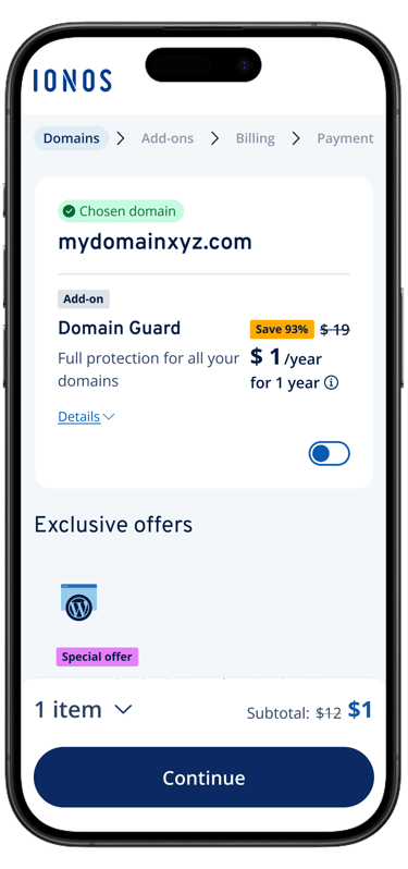
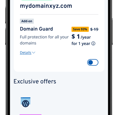
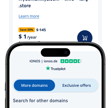
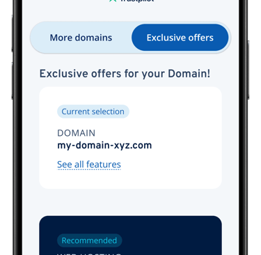
Intergated two upsell pages into ONE
UPSELL PAGE
We merged two upsell pages into one by adding a switch to switch between two different types of add-on sales pages. It reduces user resistance to marketing pages while retaining the basic marketing strategy.
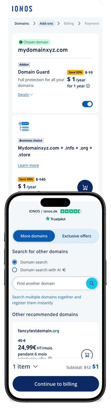
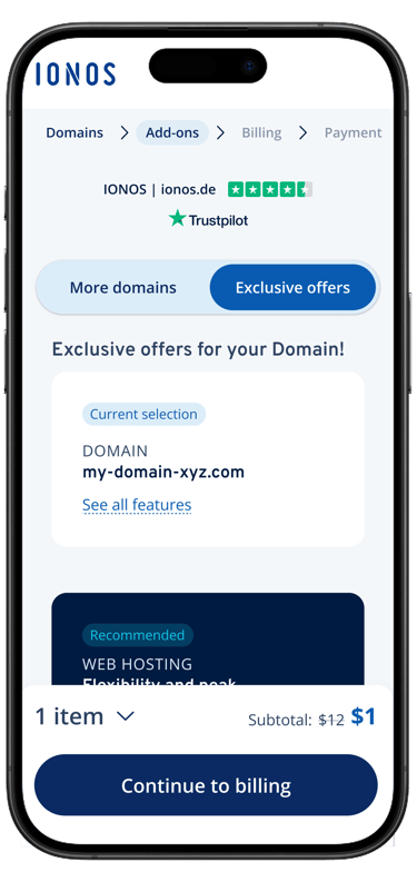
After: Switch for upsell product categories
Before
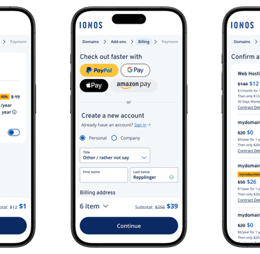
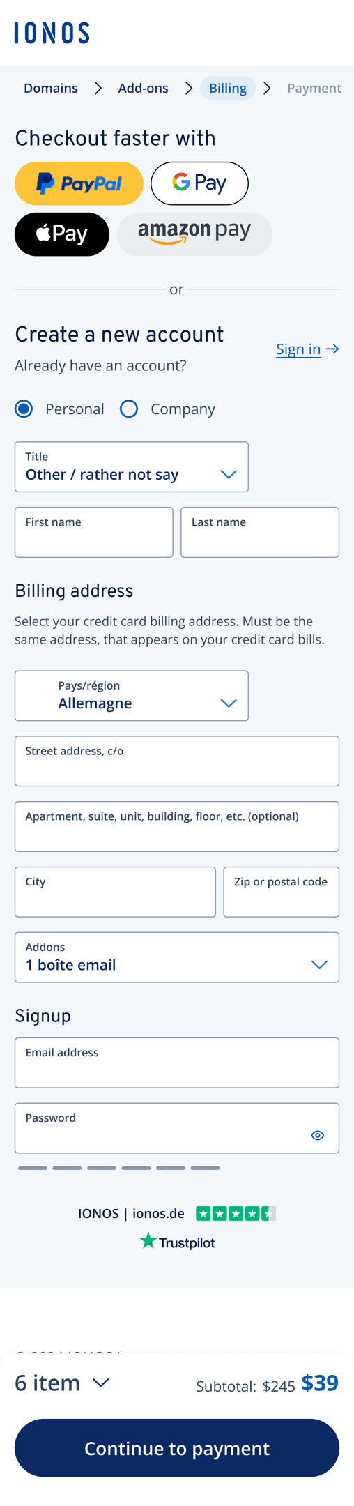
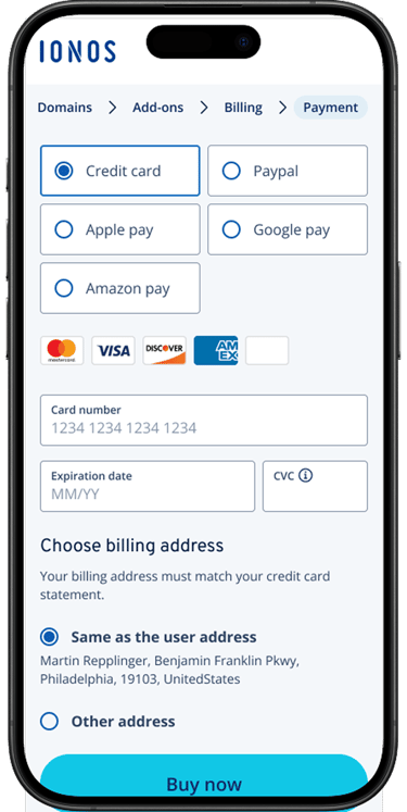
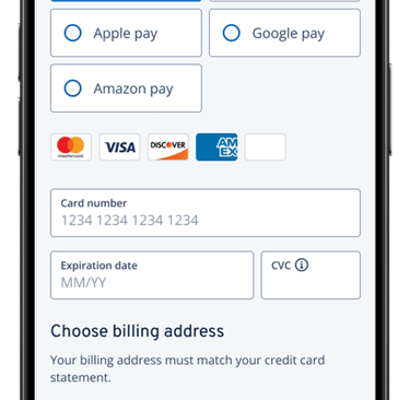
After aligning with the product owner, we added quick checkout options on mobile to streamline payment and improve completion rates. We also removed redundant text and emphasized the payment CTA for clarity.
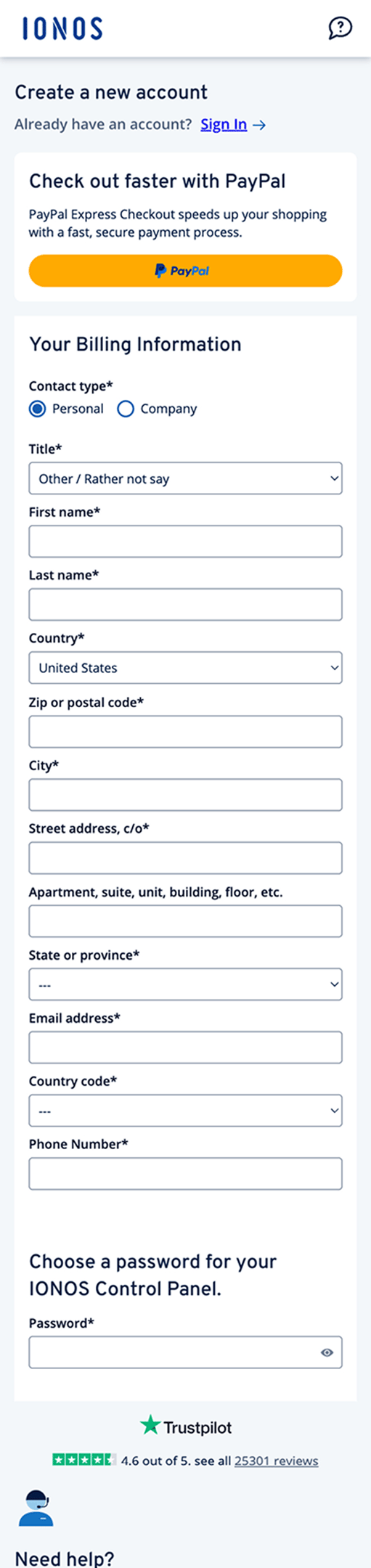
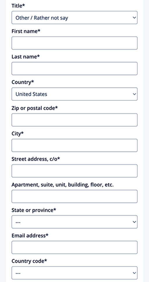
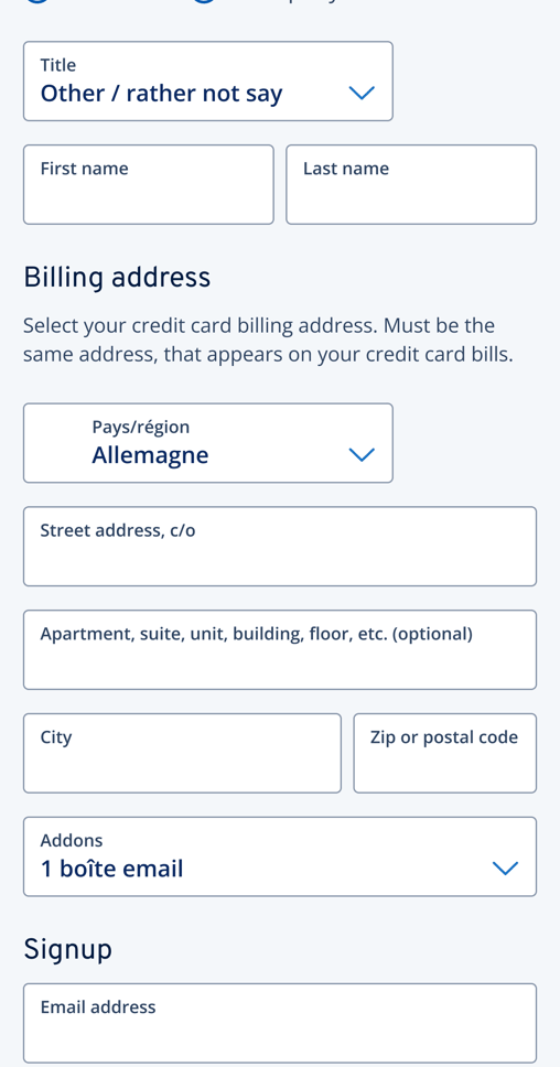
The original billing form was too long and unclear—user tests revealed confusion about the purpose of the input fields. To solve this, we restructured the form into clear sections (account vs. billing info) and optimized the layout to reduce scroll length and enhance comprehension.
More Faster Checkout CTA options and categorized form sections
BILLING FORM
Before
After: More fast checkout options and the form with sections
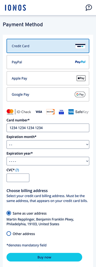
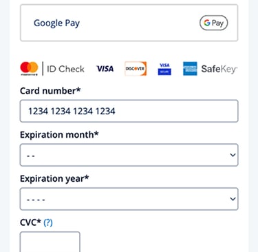
PAYMENT PAGE
Optimized payment selector on mobile
Change the layout of the paymentselector to save more space, improved option visibility, and enhanced overall usability on mobile.
Before
After: More fast checkout options and the form with sections
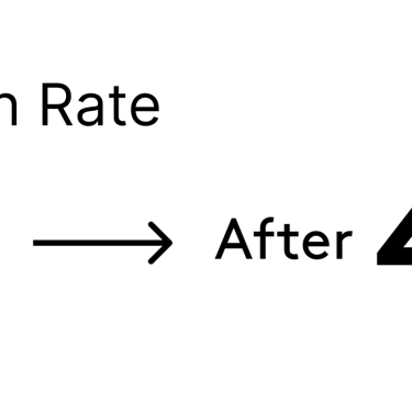
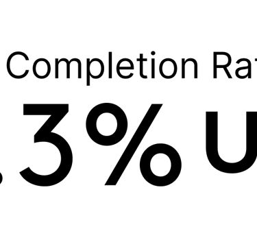
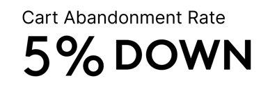
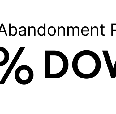
What we achieved
After conducting A/B testing on the UX improvement plan for the checkout process and the original plan, our team compared the data and found that the results basically met the expected targets. We plan to continue applying this plan in global markets in the future.